Took From www.fastcodesign.com
For Highway1, a Silicon Valley design accelerator, pros at top consultancies mentored young entrepreneurs. Here's their best advice.
At Highway1, a design accelerator based in San Francisco, startups have four months to transform a prototype into a market-ready product, develop a business plan, create a brand identity, and craft a manufacturing strategy. To ease the process, Highway1 pairs the young entrepreneurs in the program with seasoned pros from top design consultancies.
The startups that made it into the 2016 class—entrepreneurs have to apply to be part of the program—included Blumio, a medical device company that worked with Whipsaw on a blood pressure monitor; OBE, the maker of a wearable virtual reality controller, which received input from Astro; Sensassure, a senior-care company that worked with Ideo to develop a urinary incontinence product; and Calliope, a water-conservation company, which was paired with industrial designer Scot Herbst of Herbst Produkt Design.
We asked Ideo, Whipsaw, Astro, Scot Herbst, and Highway1 about their best advice for startups, the most meaningful advice they were ever given, and other words of wisdom for startups that want to hatch the next great product.

CLARK SHEFFY, MANAGING DIRECTOR, IDEO SAN FRANCISCO
While the team at Sensassure had a great idea to help a population underserved by design—they developed a urinary incontinence product for seniors—they didn't have much industrial design experience, which is where Ideo came in to help. Clark Sheffy shares his thoughts on universal design and solutions to the most common design challenges he's encountered with startups.
A startup's branding should be able to outlive its first product:
"We often work with teams that have a fantastic bit of engineering. But a product is more than what something can do. It’s about communication, delight, and something people aspire to use and will fall in love with. This means collaborating closely as a team to design how the brand will come to life for users. Most teams appreciate this, but in some cases, we’ve heard 'Oh we already bought a logo.' In general, we’ve found that companies big and small are most successful when their vision is shaped from the inside out versus from the outside in. It feels much more authentic and ownable when the approach to design is truly holistic. From the tone of a company’s story, to the visual presentation of prototypes, and even business cards, they’ll tell us how good it felt to show up aligned at investor meetings.
Keep feature creep in check:
"We’ve been in situations with teams where we challenge them on their idea and ask whether it could perform a certain function, and they will answer, 'Oh, yeah, it could do that, too.' Pretty soon the idea has grown 10 new possible scenarios for the user experience and a lack of clarity on the one thing it will do incredibly well. Teams out there need to get engaged with users, build and get feedback on a lot of prototypes, and narrow their idea to the one thing their product will do that no one else’s can, and then be able to say it in a single sentence. In other words, create a clear value proposition—and design the proof of that proposition into the product. For the great new companies of our day, that is very clear—push a button, get a car; rent someone’s apartment like you would a hotel room."
Know your audiences:
"In an era saturated with early-stage companies that are building convenience-based apps for their peers, Sensassure is working in quite possibly the least sexy and most human centered of spaces—aging and urinary incontinence. Not many 20-somethings are genuinely excited about solving for that but this team was. To better understand their environment, they physically moved into a retirement home for the better part of a year. They learned and considered the entire system, building incredible empathy and trust with their stakeholders, caregivers, and users—elderly adults—along the way. We wanted to work with them for that reason alone. They immediately struck us as an incredibly talented team who were coachable and had endeavored to deeply understand their user in the search to improve their lives."
Universal design doesn't mean lowest common denominator:
"A lot of 'universal design' has seemed to result in 'that medical look' that we all know and probably don’t really love. Putty-colored plastic, blue buttons, rounded corners. In our experience over the years, we’ve seen some really good concepts turn really awful in the pursuit of universal design principles applied ad hoc. It has come to mean, 'If you see me with this object, I’m sick.'
"Usability is incredibly important, but that shouldn’t mean designing to the lowest common denominator of an experience. And just physical usability doesn’t take into account the emotional experience of an aging person or someone with a medical condition, and how the joy of using an object, or the invisibility of using an object might also be part of the solution. What if eyewear, a common solution for those with impaired vision, were designed with universal design principles?
"If we approached senior care like we approach every other type of design, we allow for the idea that there are many, many different kinds of people out there—many of whom are aging—and they deserve interesting and delightful experiences just like everyone else."
On the best advice he's received:
"Yim Yurchenco, who led Ideo’s early engineering team said, 'Don’t settle for finished in the pursuit of good. Don’t settle for good in the pursuit of excellent.'"
NORIO FUJIKAWA, CREATIVE DIRECTOR, AND BRETT LOVELADY, FOUNDER, ASTRO STUDIOS
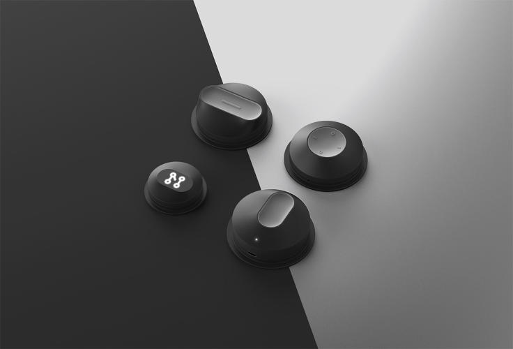
Astro Studios worked with the startup OBE to develop a wearable virtual reality controller for gaming. Their collaboration yielded a sharp-looking jacket fitted with sensors that translate natural gestures and movements in the physical world to the virtual environment. Below, Norio Fujikawa and Brett Lovelady share their thoughts on designing wearables and for VR—two fast-growing design categories.
When it comes to VR, think about transitions:
"Time and again at Astro, we see amazing technological advancements in VR, but the applications to create total immersion are the most compelling aspects of VR and one of the biggest challenges," Fujikawa says. "A truly immersive experience allows a user to shut out their real surroundings, to disregard what is happening around them, to transport them to a new virtual space. However, we are still real people once you shut down the system, remove the headset, and put down the controllers. We still have a physical existence outside the imaginary world of the machine. And the setup and transition times between worlds isn’t smooth or optimized yet. VR is currently a device- or technology-driven experience. If VR truly evolves to the next level of interaction it promises to be, the way we interact needs to evolve as well. And this is where OBE comes in."
User confidence is an essential part of the experience:
"[Designers should] continue to push what we mean by wearable technology and not think of it as just a tool that we strap to our bodies," says Lovelady. "Beyond the reality of fashion and comfort, people have to feel confident and not foolish for things they apply to their bodies, especially in social or public settings. There’s a reason most people don’t wear Bluetooth earphones—and it’s not the utility or technology, it’s the social stigma."
Think about seamless utility:
"Most wearables must provide some level of utility to offset the hassle, awkwardness, or redundancy of using them in the first place," Fujikawa says. "The more seamless, embedded, easy to use and to maintain a wearable, the longer the product will stay relevant and useful."
On the best advice received:
"Design is point of view applied to enable the hopes and dreams of people, and our job as designers is to ultimately improve the human condition, to be the advocate for people, near and long term," Lovelady says. "Regarding business, design is not art. It’s a commercial endeavor. So whatever you’re designing, build it to sell it. Otherwise YOU bought it."
DAN HARDEN, PRESIDENT/CEO/PRINCIPAL DESIGNER, WHIPSAW
Whipsaw consulted with the startup Blumio to develop a wearable blood pressure monitor that uses sensors as opposed to uncomfortable air pressure (like what your doctor uses). Below, Dan Harden dispenses tips on what makes for a strong wearable.
Design for a disappearing act:
"A good wearable product experience is when it just 'goes away' because it's so comfortable you forget it's on, like your favorite T-shirt. Since wearables are on your body they are fashion statements that speak volumes about who you are, so design is key. If that wearable provides valuable health data, like blood pressure, a meaningful experience is also when it delivers valuable instant information that you can trust and act on.
"Blood pressure is the single best indicator of general health, however blood pressure monitoring devices are cumbersome and uncomfortable. Blumio had conceived of a new type of monitor that used small radar sensors to measure blood pressure instead of the conventional air-pump cuff that squeezes the arm. The biggest design challenge for us was how to configure this new technology into a form factor and usability model that end users would appreciate, and that would define this new product paradigm. Our design solution is a seamless fabric armband that has a pocket at the end, which contains a thin and flexible electronic sensing unit. To separate the electronic unit from the armband for cleaning, the armband strap grommet pulls apart like a snap to access the electronic unit. When Blumio is on you barely notice it, but if you want to show it off, it sure looks cool."
On the best advice he's received:
"When I was interning with the renowned designer George Nelson he told me, 'Don't design more junk; the world already has enough.' Hartmut Esslinger of Frog Design often told me in his thick German accent, 'Just do eet.' This was before Wieden & Kennedy coined that slogan for Nike, and it was his way of saying don't overthink things, trust your intuition, and take bold risks."
SCOT HERBST, PARTNER, HERBST PRODUKT DESIGN
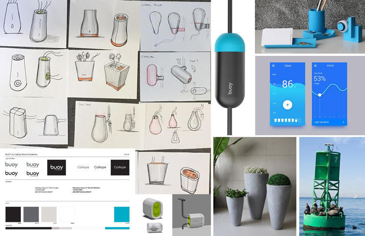
Industrial designer Scot Herbst of Herbst Produkt Design—a consultancy that's worked with Logitech, the Home Depot, Clorox, Crate & Barrel, and CB2—advised two companies in the 2016 Highway1 class: Calliope, a residential water monitor, and Cocoon Cam, a wellness monitor and camera for babies. Here's what he thinks all startups should know.
Hunt for potential flaws and iterate after you find them:
"For us it all boils down to this one cardinal rule: Be self critical. Don't be afraid to question your product or idea. You should constantly be trying to find the holes in your thinking, and the ways your innovation can be simplified. If you don't find the flaws then investors or customers will. Innovators and designers should be careful not to become so committed to a path or a specific execution that they cloud their judgment. Great innovation is guided by a constant stream of incremental pivots that reflect a fluid thought process."
Strength comes in numbers:
"Even more important than a great idea is a great team! If you have the right heads on a problem, and the right chemistry, you can't lose. The power of the group dynamic is so critical to the successful outcome of any idea."
Don't design for an oversaturated market:
"Please. Dear God. No more fitness tracking. Just stop the madness. Dare I suggest: If you really want to be healthier, step away from technology."
Best advice received:
"Charlie Munger, vice chairman of Berkshire Hathaway, always says: 'The smartest person in the room isn't the one who knows everything . . . it's the one who knows what he or she doesn't know.' I always appreciated that because so much of entrepreneurship is not being afraid to do things yourself and get your hands dirty, but equally important is knowing when it's time to delegate and defer to others who have deeper skills in some areas. The lone genius is a myth in the product world."
BRADY FORREST, VP OF HIGHWAY1
Brady Forrest has seen a number of companies come through Highway1 (close to 70 since the accelerator's first class in 2013). Below he shares advice on how startups can get off the ground.
Ask for feedback early and often:
"Getting customer validation and making sure you are building the right thing is incredibly important. Too often founders have a vision that doesn’t match a customer need. They need to let their initial idea be shaped by customer feedback and usage. Startups need to give their prototype, even at early stages, to others to try. And then they need to accept the user feedback and incorporate it as they iterate on their product. It will ensure they build the right product, and a product that people love to use. I constantly meet founders who are afraid to give their prototype to anyone to try. Waiting until you have a final product to conduct user testing is too late."
Court the right industrial designer:
"The selection of an industrial designer is incredibly important to the future of your company, because they become a partner in product development. Startups will form relationships with designers and will continue working with them as the product is refined and makes its way to market. The relationship might even carry on to future products."
Know your goals—and what it will cost to achieve them:
"Our number one goal is to help startups turn their idea into a business and their prototype into a product. A big part of this is figuring out what their key product and business development milestones are and then determining how much funding or revenue they will need to meet them. For the startups to attract investment, they need to show investors a well-developed "looks like, works like" prototype and customer validation or traction."

