Took from www.fastcodesign.com
In 2012, Pentagram designers Jesse Reed and Hamish Smyth, along with their coworker at the time, Niko Skourtis, were in the basement of the firm's New York office looking for a tarp when something bright red caught their eye. Hidden beneath a pile of clothes in a neglected gym locker was the New York City Transit Authority "Graphics Standards Manual": a 174-page, ring-bound book that dictates Massimo Vignelli's and Bob Noorda's iconic design for the subway system's signage.
Reed and Smyth decided to reproduce the manual, launching a Kickstartercampaign to raise a modest $108,000 to print 1,000 books. "We thought the audience were primarily our peers," says Reed. "We thought maybe transit people would be interested but we were mainly making it for us." They ended up raising $802,812.

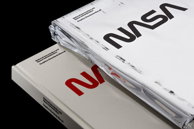
It's a fabled beginning to an unlikely business venture between Reed and Smyth (disclosure: I know both of them personally). The first campaign proved so popular that the pair decided to reissue a second standards manual: This time for the corporate guidelines for NASA's storied "worm" logo. The Kickstarter campaign raised $941,966. Now, anyone can buy the NASA standards manualonline and at select bookstores for a cool $79.

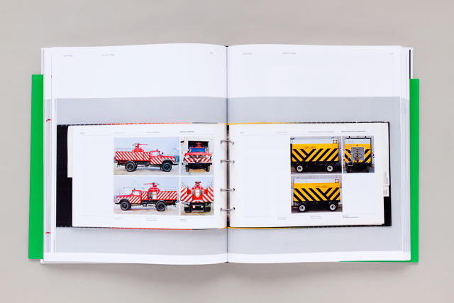
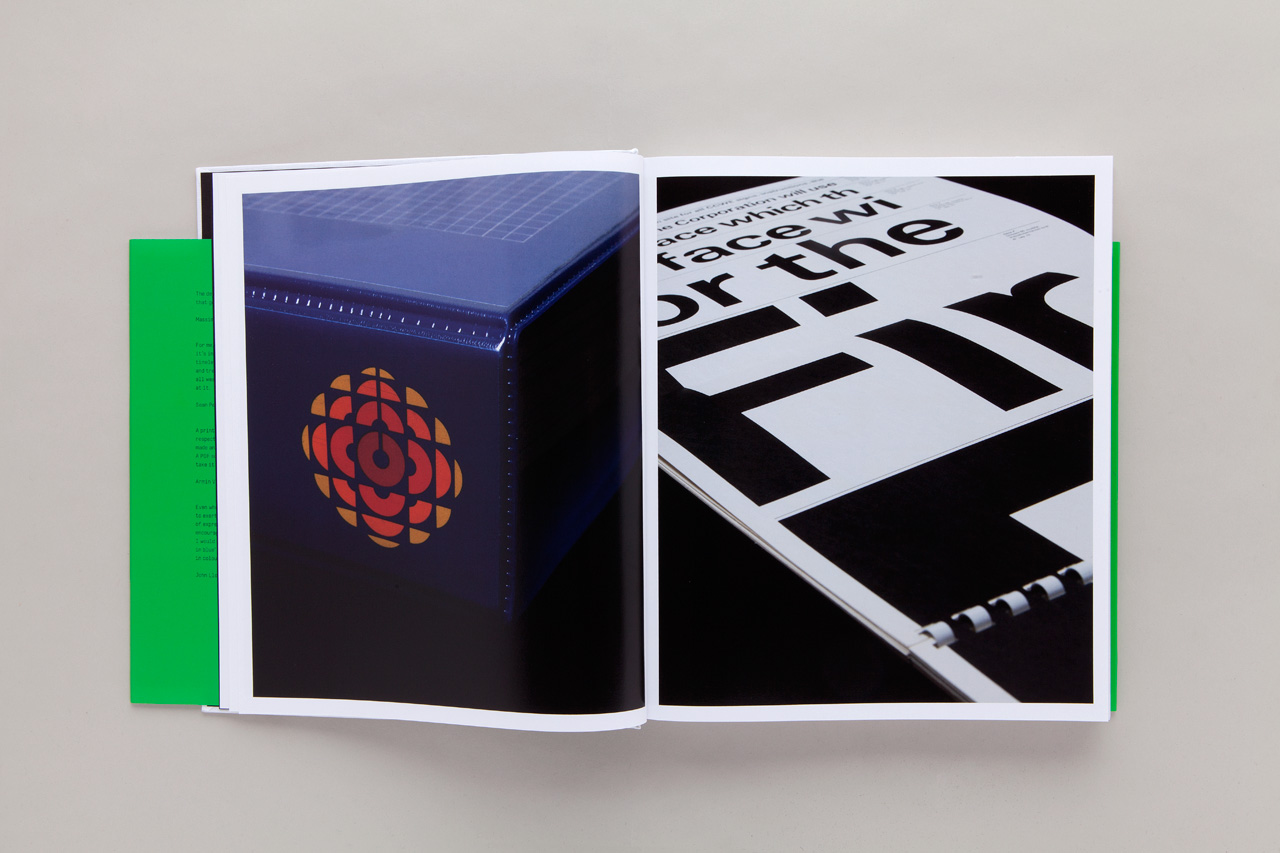
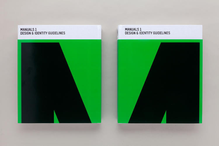
Meanwhile United Editions—the London-based publisher of design books run by designer Tony Brook and design writer Adrian Shaughnessy—was also starting to realize the mass appeal of these manuals. In 2014, Unit Editions published Manuals 1, a compendium of corporate identity manuals from the 1960s and 1970s, thinking it would appeal to a very small subset of graphic designers. "We knew there were probably a few hundred people in the world who would be interested in them," says Shaughnessy. "But we printed around 2,000 copies and they sold out in the first few months." They also sold out of a 2,000 print run of Manuals 2, a companion collection. Last month, Unit Editions launched a Kickstarter to raise money for a reprint of Manuals 1 after a call for interest received about 1,000 replies asking them to reprint.
Half a century ago, these vintage manuals served the very practical purpose of relaying design guidelines to corporate clients. So why do they still appeal—and matter—to so many designers and design fans today?

A GLIMPSE OF "THE GOLDEN AGE OF DESIGN"
The 1960s and 1970s are widely considered the golden age of corporate identity design.
As large multinational companies arose out of the post-war era, so too did the need for a unifying and cohesive corporate identity system. Corporations turned to now-legendary designers like Paul Rand (IBM, ABC), Ivan Chermayeff and Tom Geismar (Mobil, Pan Am), Saul Bass (Minolta), and Richard Danne and Bruce Blackburn (NASA, U.S. Department of Transportation) to design their visual identities. The logos that came out of this period are still some of the most iconic and enduring in graphic design history.
These designers were not just creating a company's logo, however. They were designing a visual system that clients could apply across multiple divisions and everywhere from envelopes to company trucks. To ensure that the identity was implemented consistently and according to their intentions, design firms produced weighty printed manuals that dictated everything from the precise geometry of logotype to the use of typefaces and exact shades of color.
The manuals laid out the designers' intent, but they also served a very practical purpose in the pre-digital era. Typically printed loose leaf and bound in ringed binders, designers could remove the pages of the manuals and place them under process cameras or PMT machines to make exact copies of typefaces, logos, and graphic elements. Many even supplied tear-off sheets for precise color matching.
The best standards manuals, of course, did all of this and were also beautiful documents in their own right. Vignelli and Noorda's massive manual for the New York Transit Authority (NYCTA), for example, laid out exactly how to design and implement every subway sign, detailing everything from how the signage should be arranged at the station down to the spacing between the letters. As Shaughnessy writes in his introduction to Manuals 1, "above all else, it is a beautiful working document: elegance of form is combined with extreme functionality, and the result is a guide to making life better for those using New York’s vast transit system."
Today, designers still produce identity guidelines for companies to follow, though now they are digital and, generally speaking, much less extensive. "They can range from 12 pages to a couple hundred pages," says Tom Geismar, whose firm Chermayeff & Geismar (now Chermayeff & Geismar & Haviv) designed some of the most famous logos of the 20th century, including for NBC, Chase, Mobil and Pan Am. "Up through the '80s at least, there were some that were very big and tried to cover everything, and pretty elaborately. Today most are online, or they're PDFs that someone can print out if they need something. So the production value is very different."
The move from weighty, expensive, authoritative printed manuals to digital files stored in a shared database might help explain some of why the reissues appeal to designers today. "Online documents that you download have a sort of intangibility, an ephemeral nature that people don’t really take seriously," Shaughnessy says in an interview. "What these big, cumbersome brute of a ring-bound manuals did was that they had a natural authority, and they were things that people respected and wanted to follow. So I think that’s what designers respond to."

ROMANTICIZING A BYGONE ERA
When I met with Reed and Smyth at the Pentagram offices a few weeks ago, they agreed that there is an element of nostalgia to the recent wave of appreciation for vintage standards manuals. Sitting at a round table in one of the firm's conference rooms overlooking Fifth Avenue, the reissued NASA manual and NYCTA manual between us, Reed and Smyth ruminated over their own interest in the manuals.
"There’s a very romantic view of being a designer in that era," says Smyth. "It was basically a different profession. You see photos of Massimo’s staff wearing lab coats to work. They were artists and they were technicians. You did everything by hand and, even though it was harder to do, to us it seems simpler."
There are other factors that explain the manuals widespread appeal, too. The clients behind both manuals—the NYCTA and NASA—carry cultural significance outside of the design world. They're also prime examples of Swiss-style modernist design, a particularly zeitgeist-y aesthetic right now. "I don’t know if it's a generational thing, but our generation—designers who are 25 to 35 working right now—has really fetishized this style of design, especially from the '50s, '60s, and '70s," says Smyth.
The designer Richard Danne, who designed NASA's worm logo along with his partner at the time, Bruce Blackburn, says he sees a reverence for both the aesthetic of modernist graphic design and the practice of graphic design in the '60s and '70s. During his recent travels to universities to speak to design students, he's noticed that students are impressed by the amount of attention and care that goes into creating both the manuals and the identity systems they represent. "I think they appreciate the depth and maturity of the program represented in the manual, and that these are very three-dimensional (like architecture) and profound," he writes in an email. "They are monuments to the 'golden age of design' and seem to say: 'l'm excellent, well conceived, and well crafted. I’m here . . . and I’m here to stay!'"

WHY WE'RE STILL DRAWN TO PRINT
As Geismar points out when we speak over the phone, it's the production of these manuals that has changed, not the design process. Graphics standards manuals designed today can be equally thorough and precise in terms of content. The benefits to digital guidelines, especially as companies have gotten more global, are obvious: They're much less expensive to produce, they can be accessed anywhere, and they can be easily updated. Making big, expensive-to-produce design manuals just isn't practical anymore, but that doesn't make the design of the guidelines or the work itself any less.
Still, it's hard to imagine a digital file having the same effect on designers 50 years from now as these printed manuals have on designers today. The industry at large, not merely the process of designing, has changed a great deal in the last half century. In the golden age of corporate identity design, designers were viewed as experts in visual identities, and were entrusted to be truly in charge—their hulking manuals just further cemented their authority on the matter. We now live in the age of branding; design is out of the shadows, but now everyone's got an opinion on it.
Shaughnessy thinks that the manuals hold such appeal for designers today because they are bastions of good design. "For me, I think it’s got something to do with, or as much to do with, this interest in information design," he says. "The manuals are absolute miracles of information design. One of the things Vignelli says in the text [in his contribution to Manuals 1, just before his death in 2014] is a good manual is one that works, it’s one that delivers, and it can only do that if it's a good piece of information design. In other words, design that you can follow, instructions that you can enact and follow." In that case, designers working today can still learn a great deal from these standards manuals and how they communicate the esoteric details of a design system to a wider audience.
Reed and Smyth have launched a full-fledged business off their profitable reissue of the NYCTA and NASA manuals, and another reissued manual is already in the works (though they declined to disclose details). Given that there are still many vintage manuals lying around, other reissues will likely follow (a designer in the U.K. Kickstarted a reissue of the British Rail manual back in December).
Whether reissuing these manuals is as valuable for the design community as it is profitable for those doing the reissuing is up for debate. For Shaughnessy, the freshly printed facsimiles lose some of what makes the originals, collected by design aficionados, so special. "Part of the appeal is that they are working documents, so they’re a bit battered and worn at the edges, and frankly I think that adds to their appeal," he says. "But people do need to make sure they don’t die out."
After all, these manuals have been accessible for years on the Internet, courtesy of collectors who take photos of every page and put them online. Yet as Smyth points out, for graphic designers there's nothing quite like the nostalgic appeal of a printed artifact. "On our website we have high-resolution scans of both manuals, so you don’t have to buy the book to see it," he says. "But as all designers know, it’s better in a book."

